Since day one, typography has been the most challenging skill? medium? to grasp due to the restricting nature of a font and how you could spend hours searching for the right font or perfect combination. Therefore, this one was very difficult but also quite fun.
Made with:

The aforementioned challenge was finding the right font and knowing how to illustrate the meaning of the word by manipulating the font.
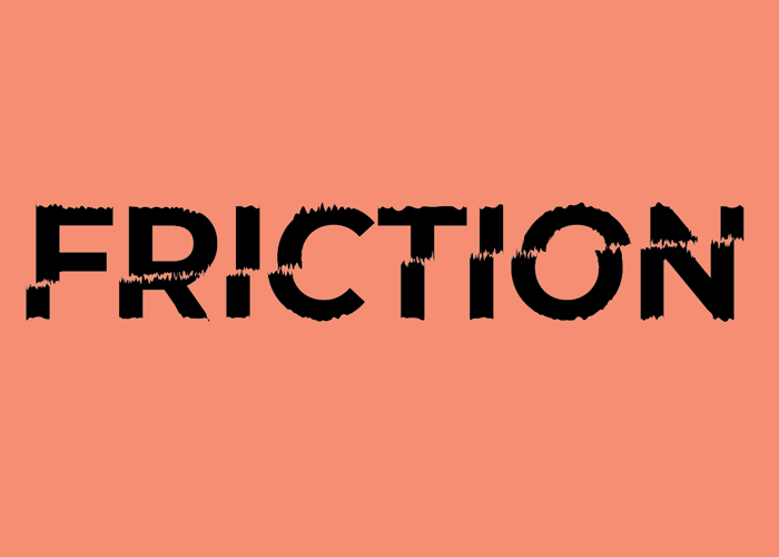
Out of laziness I went with a sans-serif font because it's safe and you can't really go wrong with it. Maybe predictable but still functional! The fun came through the choice of words and adding simulated grit to the word 'FRICTION'. In case it wasn't already on the nose, the way the top is slanted represents the friction that prevents it from sliding to the left.
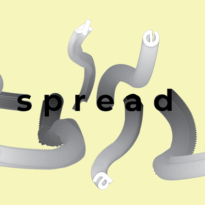
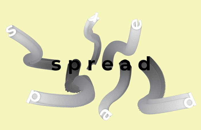
For 'spread', I loved the idea of using the blend tool on Illustrator to represent the word. Of course I thought of how bacteria and COVID spreads, so I wanted the path of each word to look random and aimless.
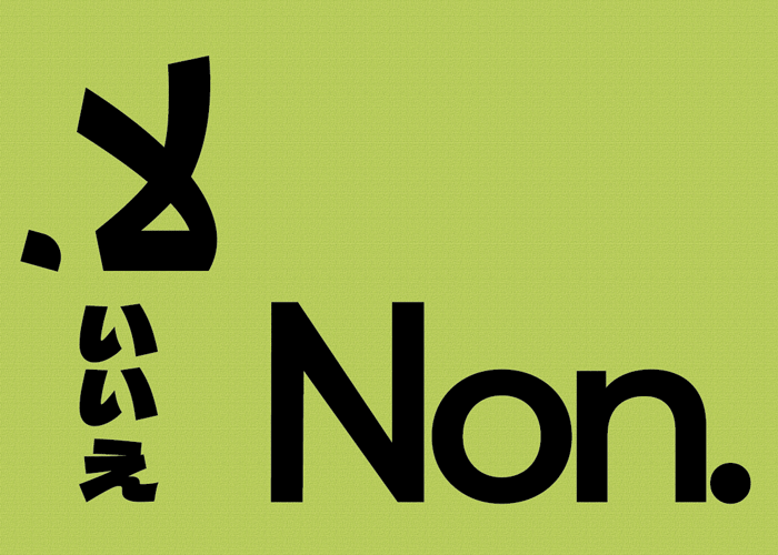
Finally, For 'Non.' This felt like cheating, but I liked the cheekiness of emphasizing that the word no is a complete sentence when spoken. While painfully obvious, you have sexual assault as a reminder that not many people understand the meaning of the word 'no'. It's written in other languages to represent the universality of how it ends a conversation. Because of the way Japanese and Arabic are read, it's placement also signifies that no matter what direction you normally read in, it is still a complete sentence.