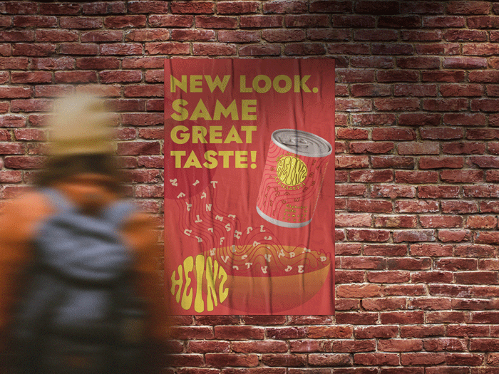
The idea behind this project was to rebrand the Alphagetti. The direction I decided to take was a minimalist/ modernist approach. I had recently gotten into Star Trek and I wanted to poison it with the question of "What would advertising and consumerism look like in their world?", while the finished product is in no way futuristic, I wanted to see how I could apply minimalism to a product that is whimsical and fun.
Made with:


Like most things minimalist, you run into the issue of looking very sterile and almost lifeless. Then you also have to add into the mix that this is advertised towards kids and parents. How do you still keep the whimsy of Alphagetti but align it with the American housewife who pronounces 'Target' as 'Targé'?
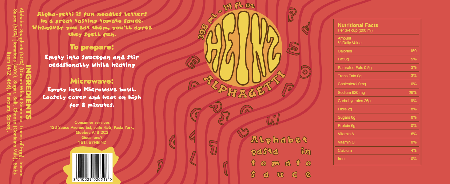
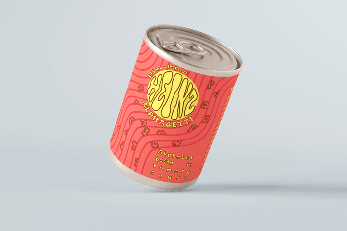
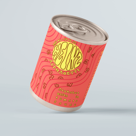
First it started with making sure that the fun letters were on the label! I'm not sure if we were provided the font or not, but regardless, it had to be on face of the label. The logo then had to change to be inviting as opposed to the original serious looking one. This would also work for the poster because of its minimalist illustration of the pasta being poured into a bowl.
For the face of the logo, the pouring motif is repeated behind the logo. This was done using distorted lines to represent the ripples of sauce being poured. This is unrealistic, but it would be cool if it was actually printed that the lines are metallic to catch the attention of kids.