This Project was a fun exploration of how typography is used within our day to day lives and analyzing the appeal and intent behind using each font.
Made with:


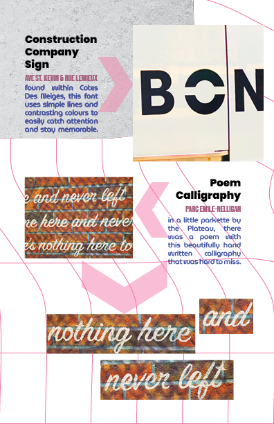
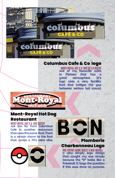
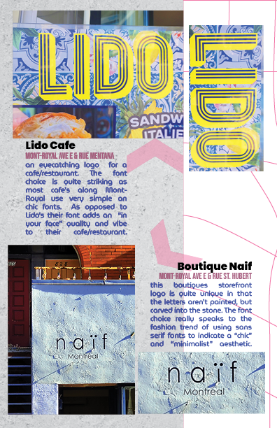
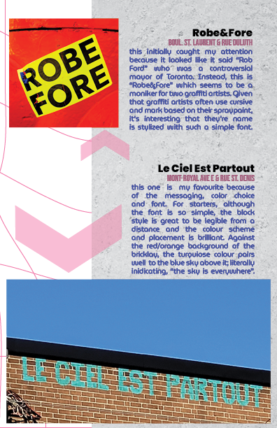
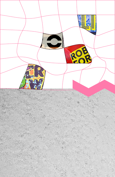
The challenge here was how to I was going to make amateur photography of fonts around Montreal pretty.
Since the pictures aren't the best composed shots, I wanted to lean into the chaos with the way it was displayed within the pages. All the text for each image would be compact and logical in regards to the title, location, and description. But the markers that point to the image and the way they are layed out leans into the messiness of the images.
What helps structure the the layout and bring some sort of logic to the chaos is the grey textrue and distorted grid assets plastered throughout each page.