This project was one of the very first excercises I got in layout design. I was quite obssessed with AdBusters at the time so I decided to stake a stab at the grungy/ hodge-podge/ scrapbook aesthetic.
Made with:


So, the content to anyone outside of the world of design would simply not care about this book. How does one make a design book engaging for non-designers?
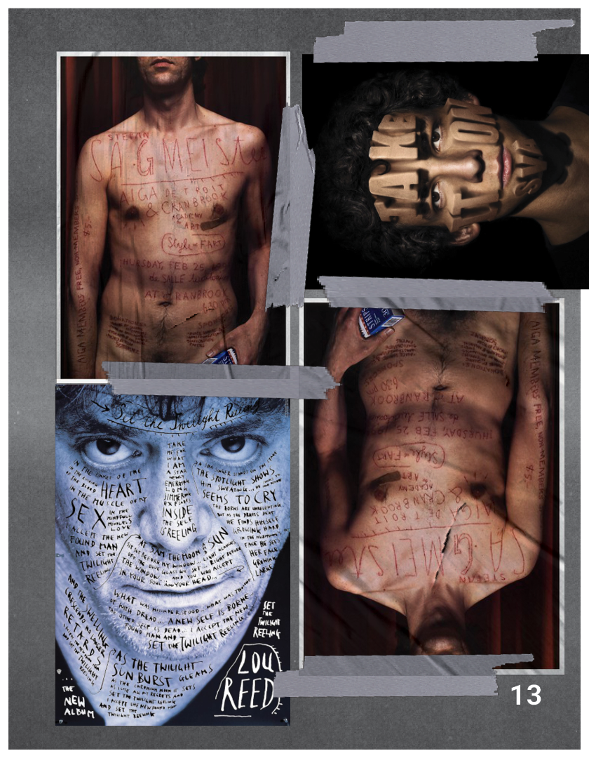
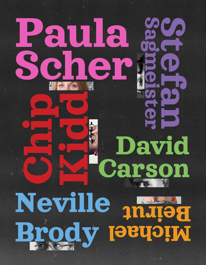
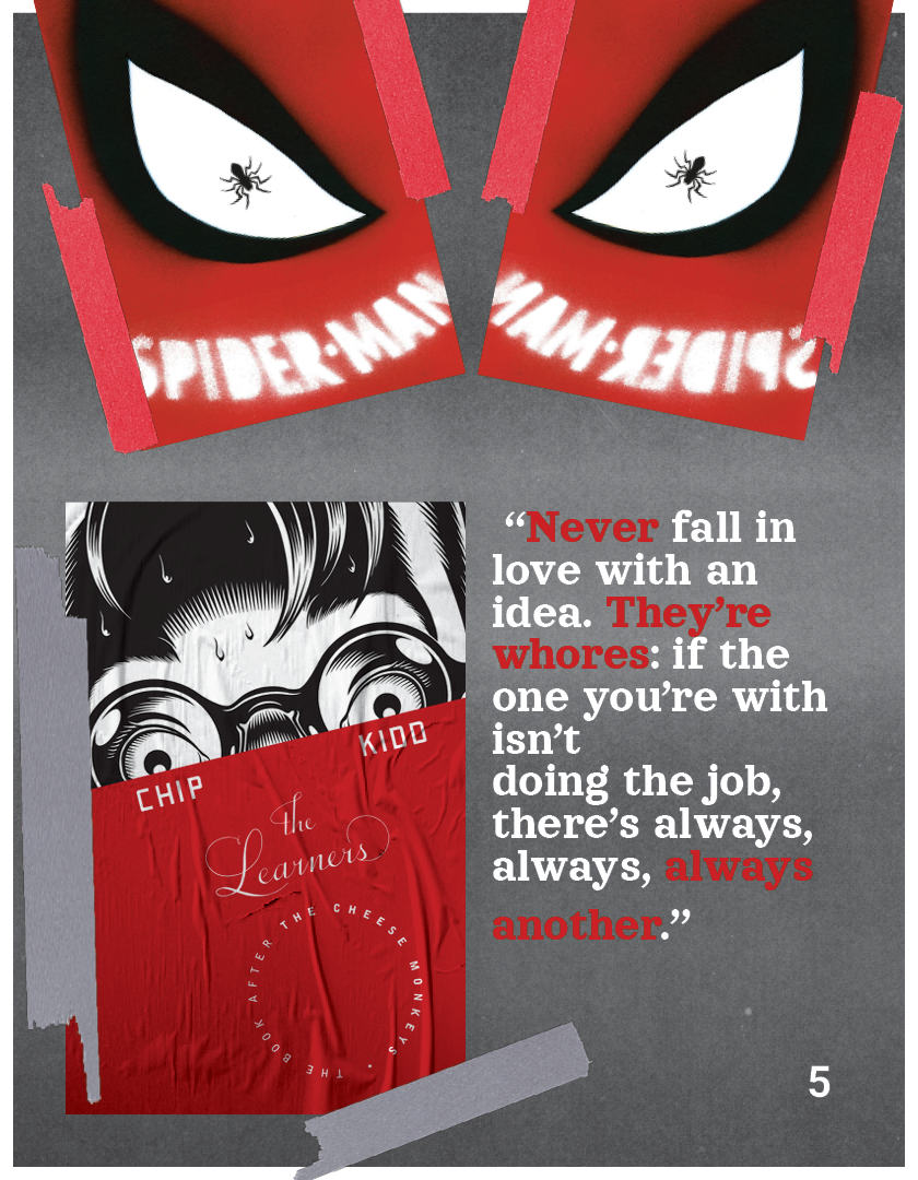
It was never my intent to make such a creepy looking cover, but I do enjoy that my accidental solution to making the cover interesting was shock value because at first glance, it could look like a collection of serial killers.
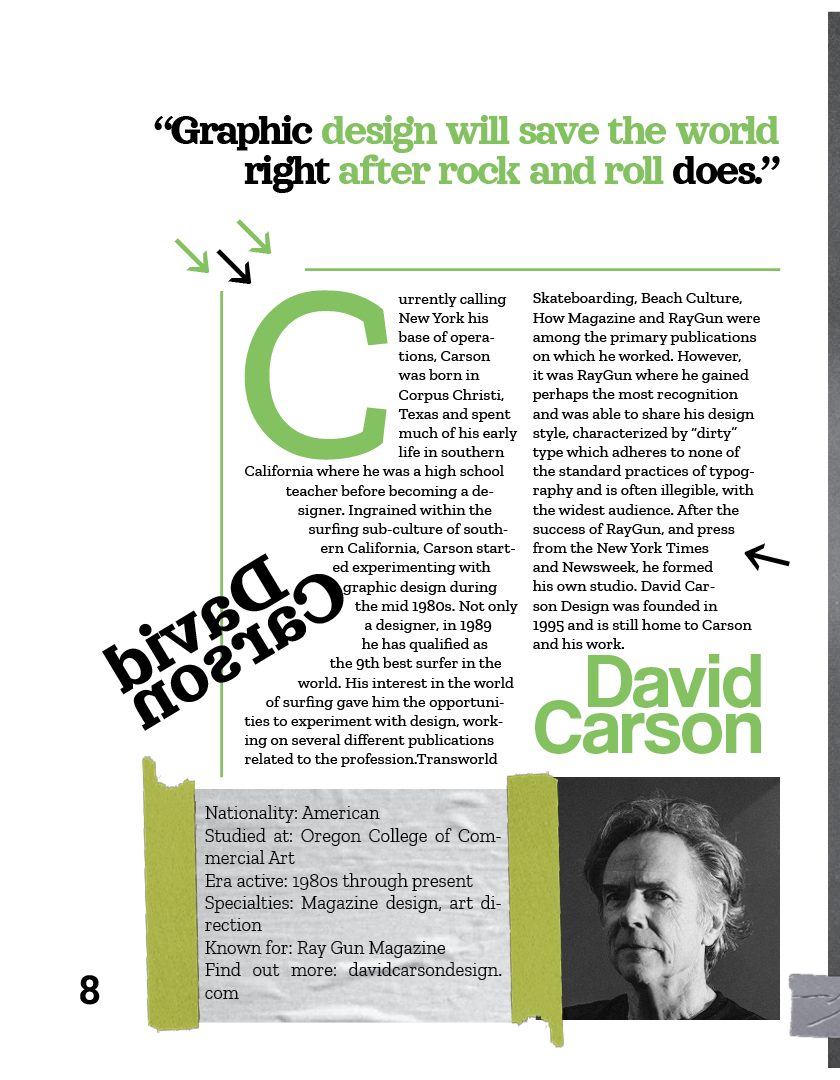
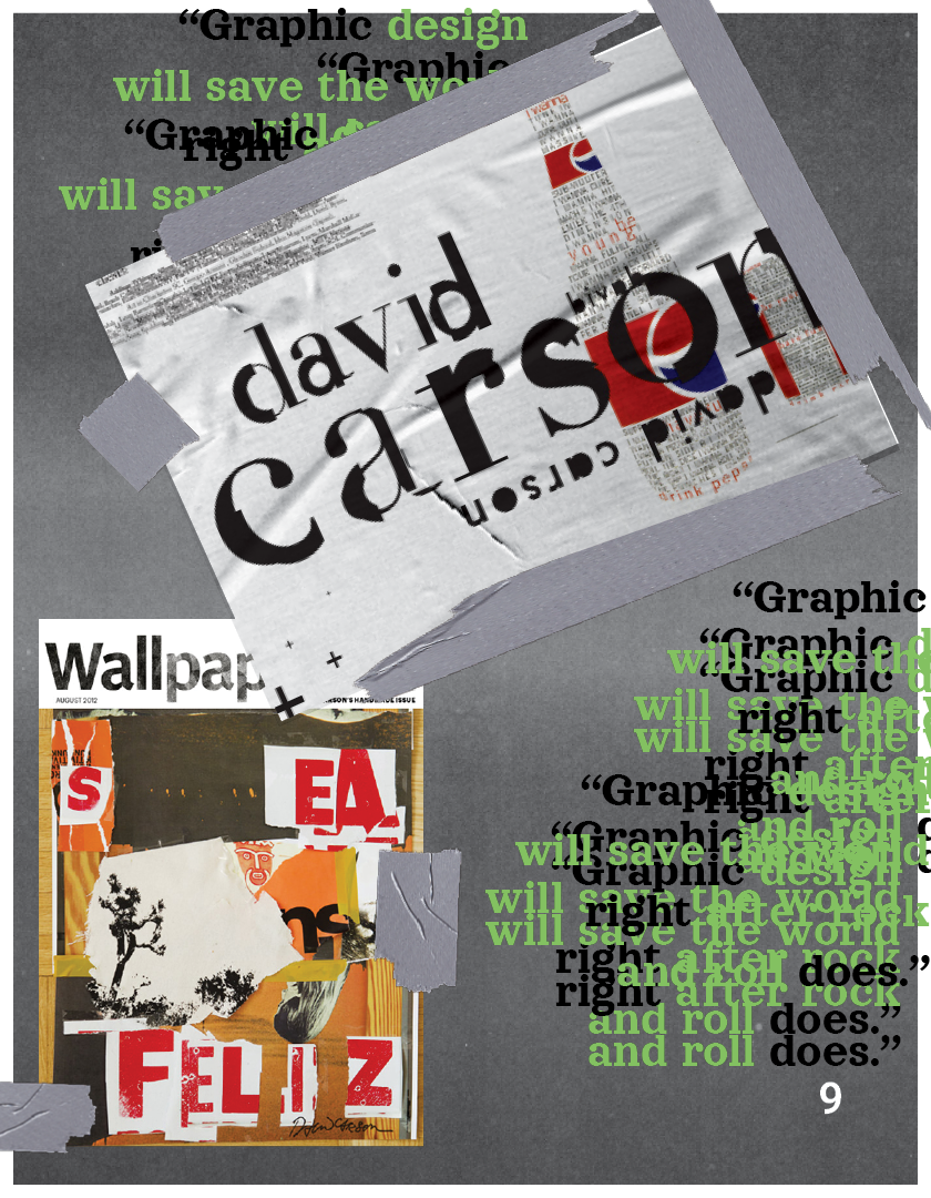
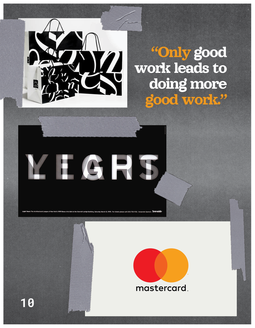
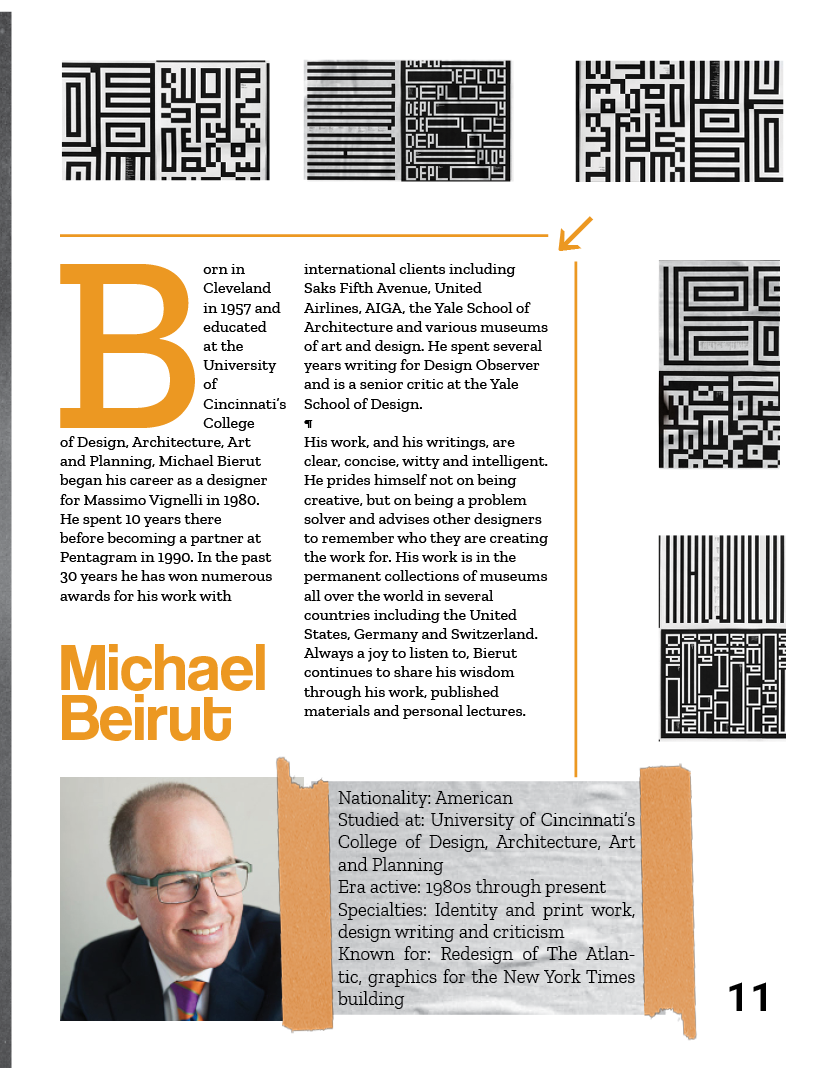
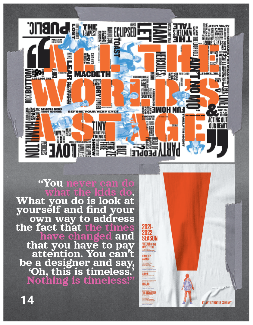
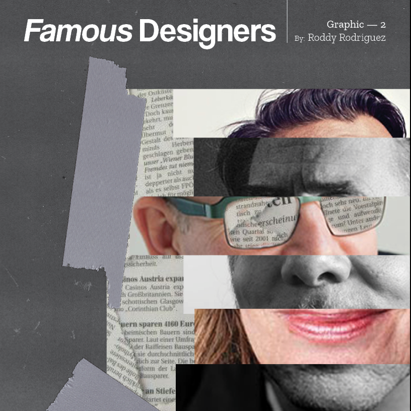
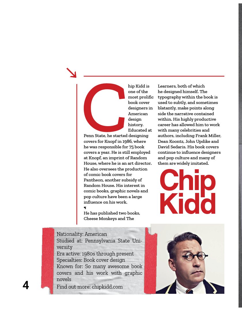
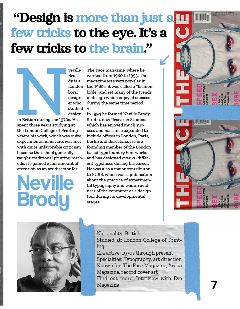
The 'scrapbook' theme is consistent in the way the images and description text is laid out by using the fake tape texture. The layout itself follows a logical rhythm of alternating between a full page of images and the text heavy bio.
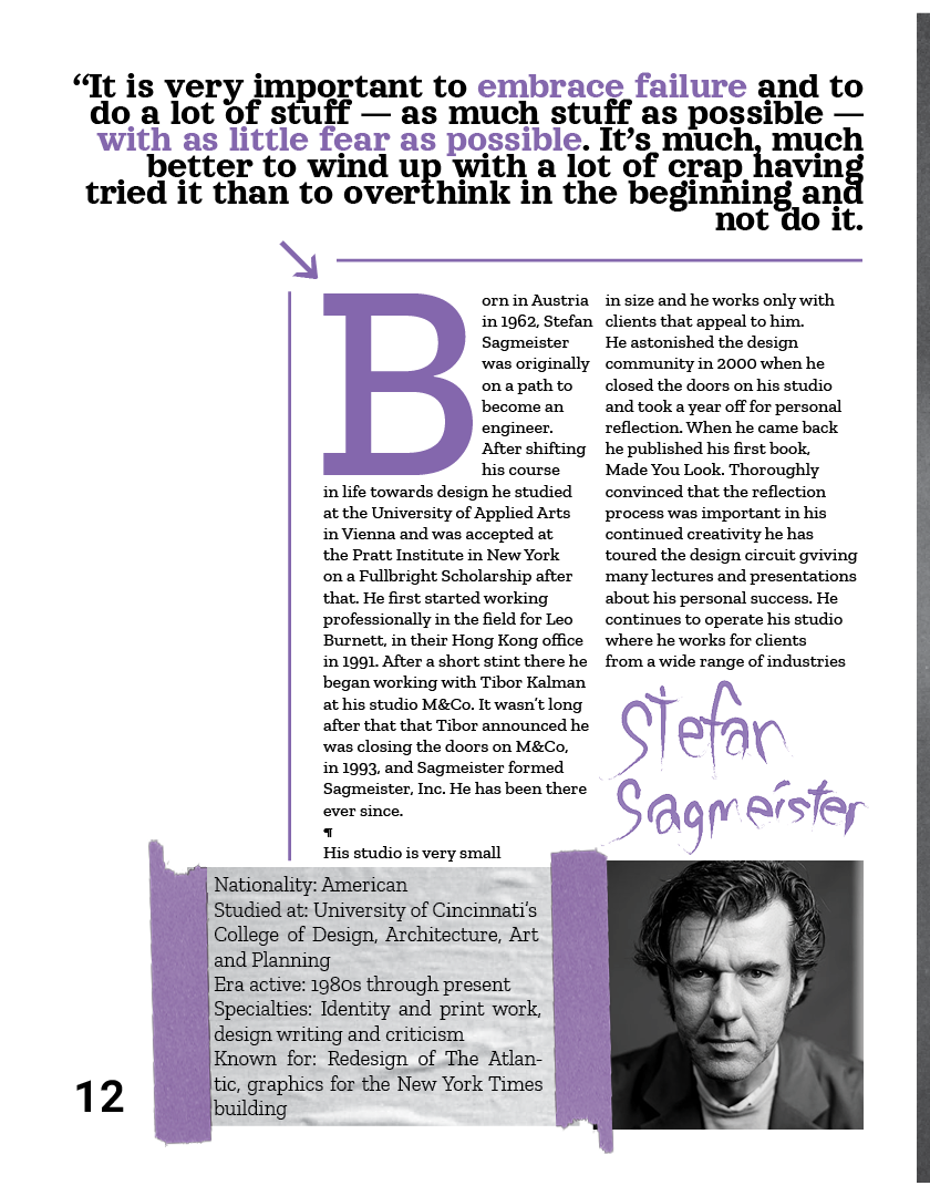
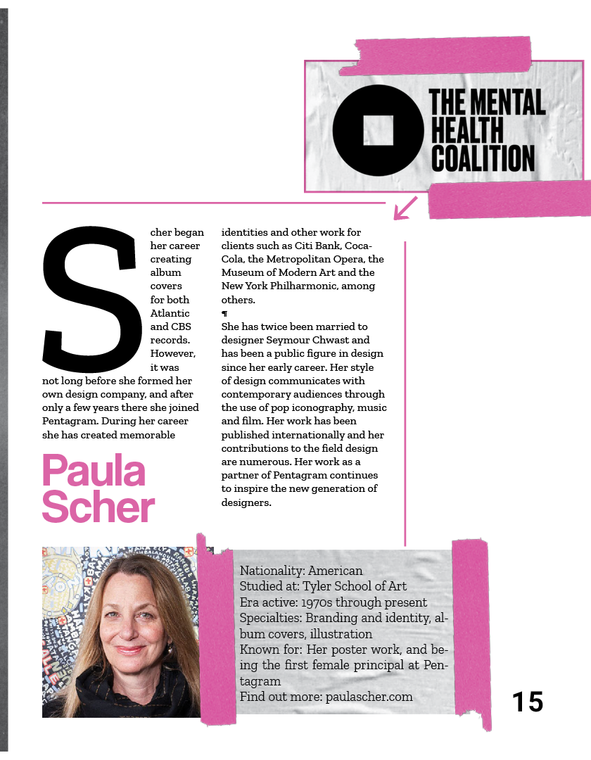
Each designer was also given a color for their particular spread; it can be seen applied in the dropcap, the designers name, and the tape.